Exercises
Exercise 7: Reproducible reports with R markdown
Read Chapter 8 to help you complete the questions in this exercise.
Before the session. This exercise needs the
rmarkdown, knitr R packages, a LaTeX
installation so that you can make PDF documents, and the
ggplot2 package, which you installed for Exercise 6. Work
through Setting
up R markdown, under the Setup menu above, before you come
to the session. It takes about fifteen minutes and most of that is a
download running by itself, but please don’t leave it until the morning
of the session. If you hit a real problem we’ll help you at the start of
the session, but we can’t get everybody set up and still have time to
cover everything in this exercise.
Up until now everything you’ve written has been R code. This exercise is about producing a document for somebody else to read (including you, or the future you), in which your writing, your code and your results and interpretation all live in the same R markdown file. Because they’re in the same file they can’t drift apart, which is what we mean by a reproducible report. Change the data, press one button, and every number, figure and table in the output file updates itself.
It’s also the exercise that brings a lot of what you have learned so far on this course together. So, you’ll be importing data, checking your data, transforming variables, drawing plots and summarising data into tables. You’ll set these processes out in an order that best makes sense to your reader and describes what your data is, what you did to your data and why, and what you found.
That order is the point. A report is not just a pile of results, it’s a reproducible account of your work.
The figures in this exercise use ggplot2, the way
Exercise 6 did. If you’d rather draw them with base R then please do.
That’s one of the nice things about R. Nobody makes you work in one
particular way, so use whichever you’re quickest and most confident
with. If you want to follow this exercise (and solutions exactly) then I
recommend that you use ggplot2.
You’ll build one document across the whole exercise, adding something to it at each question, so don’t start a new file each time. There’s a lot of new vocabulary here, so take it slowly and knit often. Knitting after every small change is the quickest way to see what each thing does and the quickest way to find out which change broke something.
1. Right, let’s make a start. Open the RStudio Project you have been
using for this course. Create a new R markdown document by going to
File -> New File ->
R Markdown... (see Section 8.4 of the
Introduction to R book if you would like to read about this first).
The first time you do this, RStudio might tell you it needs to install some packages (although if you have followed the setup instructions this probably won’t happen). Let it, and wait for it to finish.
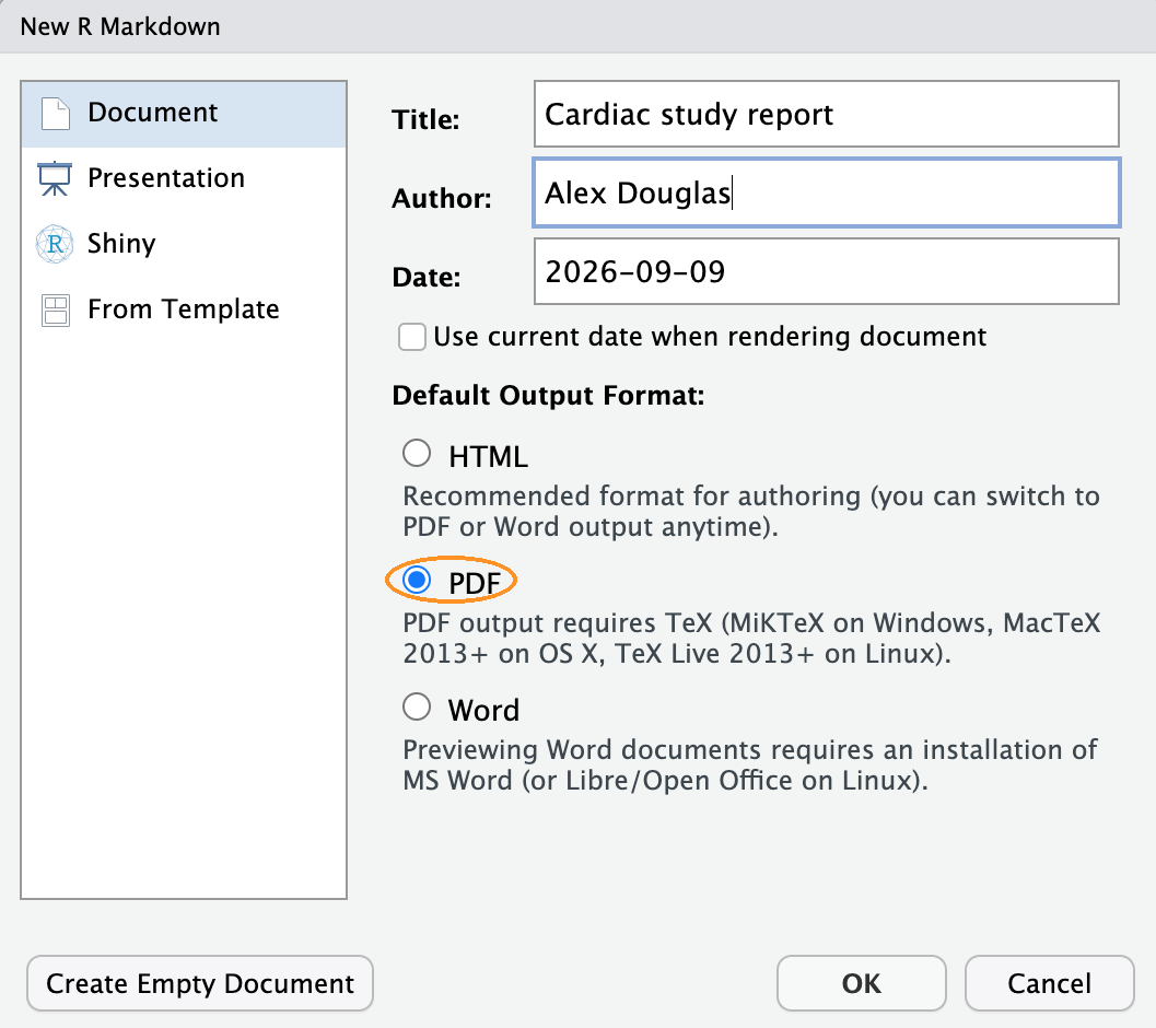
In the dialogue box that appears, type
Cardiac study report in the Title box, put your name in the
Author box, choose PDF as the default output format,
and click OK. RStudio opens a new document that’s already full of
example content about cars. That’s normal, and we’ll delete it in a
moment.
Watch the output format, because HTML is selected for you and we want PDF.
Before you change anything at all, save the file into your Project
directory as cardiac_report.Rmd (File ->
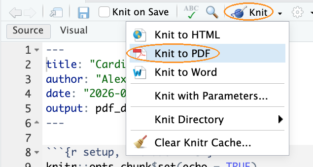
Save As...), then click the Knit button at
the top of the editor. You can also press Ctrl+Shift+K, or Cmd+Shift+K
on a Mac.
The Knit button is the ball of wool. The menu hanging below it in the picture comes from the small black triangle beside the button, and you don’t need it now, because you chose PDF in the dialogue box a moment ago and clicking Knit will give you one anyway. It’s worth knowing it’s there, and we come back to it in Q13.
Do this before you understand any of it. If a PDF appears then your setup is working, and you can be confident that anything which goes wrong later is something you can fix.
2. An R markdown file has only three kinds of content, and everything else is a variation on them (Section 8.5 of the book takes each of them in turn):
- the YAML header at the very top, between the two
lines of
---, which controls the document as a whole - text, written in a simple markup language called markdown
- code chunks, which look like this:
Here they are in the document RStudio has just made for you. The two code chunks show that a document alternates between text and code as often as it needs to, and that only the YAML header is in one piece at the top.
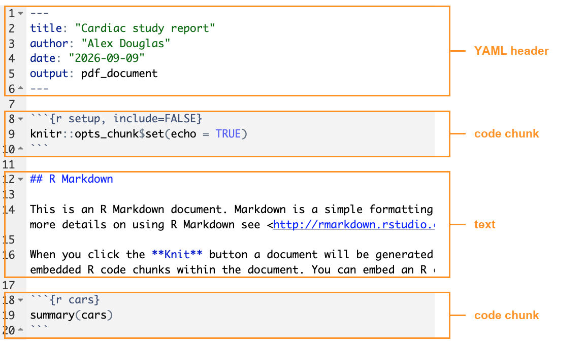
Find one of each in cardiac_report.Rmd, the file you are
editing rather than the PDF it produced, so that you can recognise them
when we start changing them. Then delete everything in
cardiac_report.Rmd below the first code chunk, the one
called setup, leaving the YAML header and that chunk in
place. Knit again to check you have an empty but working document. This
is your starting point.
While you’re in that setup chunk, add
library(knitr) and library(ggplot2) to it.
You’ll want a couple of functions from knitr later on and
ggplot2 for the figures, and the best place for a
library() call is at the top of a document rather than
buried in the middle of it. Do it now and you won’t have to think about
it again.
Your setup chunk, with the two packages loaded at the
top of the document:
```{r setup, include = FALSE}
knitr::opts_chunk$set(echo = TRUE)

library(knitr)
library(ggplot2)
```
3. Now let’s take control of the YAML header (see Section
8.5.1 of the book). Find the output: line, which
currently says pdf_document on the same line as it, and
turn it into the indented block shown below.
Two warnings (because this is where people lose ten minutes), indentation in YAML matters, so copy the spacing exactly and use spaces, never tabs.
Build it up rather than pasting it in one go. Put
pdf_document: on its own line first, with
toc: true indented underneath, and knit. Then add
number_sections: true below that and knit again. Doing it
one line at a time, and knitting after each, is how you see what each
one actually does. Here is what you are aiming for:
---
title: "Cardiac study report"
author: "Your Name"
date: "2 November 2026"
output:
  pdf_document:
    toc: true
    number_sections: true
---
4. Most reports start by telling the reader what the data are, so that’s where we’ll start too. You already have a description of these data in Exercise 3, Q4. Copy the first 3 sentences of the data description into your document underneath the setup chunk, then use markdown to format it. There is no R code in this question.
- put a heading above it, written as
# Introduction, and a second smaller heading below that, written as## Data description - in the text, change cohort study in bold, by
writing it as
**cohort study** - put measurements in italics the first time it appears, by
writing it as
*measurements* - set four of the variables out as a bulleted list at the end, each line starting with a dash and a space. Use age, systolic blood pressure, HDL cholesterol and smoking status, since those are the four the rest of the report uses
OK, that’s enough to be going on with. If you want to add a link, a
numbered list, a quotation or a table, Section
8.5.2 of the book has the syntax for all of them, and there’s a
summary on the R markdown cheat sheet under Help ->
Cheat Sheets.
Knit, and look at the R markdown file and the PDF side by side.
Notice that the headings you wrote have appeared in the table of
contents on their own, because of the toc: true you added
in Q3.
# Introduction

## Data description

These data come from a **cohort study** of the risk factors for cardiovascular disease.
A group of adults, aged between 55 and 75, were examined at the start of the study and a
range of *measurements* was taken on each of them. Each row of the dataset is one patient,
identified by a unique patient number (`patno`), and each column is one of those
measurements.

The four measurements used in this report are:

- age, in years
- systolic blood pressure, in mmHg
- HDL cholesterol, in mmol/l
- smoking status
5. Next, let’s deal with the data. There are a few small steps here, so take them one at a time.
Insert a new code chunk (see Section 8.5.3 of the book) by going to
Code->Insert Chunk, or with the keyboard shortcut Ctrl+Alt+I, which is Cmd+Alt+I on a Mac. An empty chunk appears. There’s nothing magic about the menu, so if you’d rather, just type```{r}on a line of its own and```on another line below it. Anything you put between them is a chunk.Give the chunk a name by typing it straight after the
r, so the first line reads```{r import}. Naming chunks costs nothing and makes them far easier to find when something goes wrong.Inside the chunk, import the
cardiacdata.txtfile exactly as you did in Exercise 3, Q5, with theread.table()function, writing out theheader,sepandstringsAsFactorsarguments, and assigning the result tocardiac.In the same chunk, add the two
factor()lines from Exercise 3, Q7 that createFsexandFsmoking. Hopefully you’ll remember why, but just in case you’ve forgotten, the originalsexandsmokingvariables are coded in the file as numbers, 1 and 2 for sex and 1, 2 and 3 for smoking, but they’re really categories not numbers. Thefactor()function attaches a meaningful label to each code and leaves the original columns untouched (see?factorand Section 3.1 of the book for where factors sit among R’s data types).
You’ll need Fsmoking for the boxplot in Q7 and the table
in Q8, and both of them read better with words in them rather than
numbers.
- Now run the import chunk in the editor with the small green arrow at
its top right corner of your R markdown document in RStudio. It’s the
rightmost of the three little buttons there. If you can’t see it,
Code->Run Region->Run Current Chunkdoes the same job, and so does Ctrl+Alt+C, or Cmd+Alt+C on a Mac.
Running the chunk puts cardiac into your Environment, so
you can check the import has worked before you go any further and so the
dataframe is there if you want to try something out in the console. It’s
worth getting into the habit of running a chunk before you rely on
it.
Then knit the whole document by clicking on the knit button. Notice that knitting starts a completely fresh R session, so anything you made earlier in the console doesn’t exist when the document knits. That’s exactly what makes it reproducible, and it also means the chunk that imports the data has to come before any chunk that uses it.
The import chunk:
```{r import}
cardiac <- read.table('data/cardiacdata.txt', header = TRUE, sep = "\t", stringsAsFactors = TRUE)

cardiac$Fsex <- factor(cardiac$sex, levels = c(1, 2),
                       labels = c("Female", "Male"))

cardiac$Fsmoking <- factor(cardiac$smoking, levels = c(1, 2, 3),
                           labels = c("Current", "Ex", "Never"))
```
6. OK, now we have the data imported, the next thing to do is validate the data by checking for mistakes or inconsistencies. So, in this question we’ll not only perform the validation with R code but also explain what the validation shows and any decisions that we make along the way.
Add a new heading called ## Data validation below the
previous chunk, then build the section up underneath it in four
pieces.
One sentence directly under the heading saying how many patients are in the dataset. There are 163, and for now just type that straight in as an ordinary number. You’ll come back to that sentence in Q9.
Below it, insert a code chunk named
validationholding the three lines from Exercise 4, Q1 that set the impossiblebmi,triglycerideandhdlcholvalues toNA. Remember that your report imports the raw file from scratch every time it knits, so if the cleaning isn’t in the document then it won’t happen.Beneath that chunk, write a short paragraph of two or three sentences saying which variables you changed and why you set them to
NArather than deleting those patients or correcting the numbers yourself.Lastly, the variable
alcohol, which you’ll remember from Exercise 5, Q9 needed some work as well. A small number of patients drink a great deal more than the rest, which leaves the distribution with a long tail to the right, and you took the square root to pull that tail in. That’s a data preparation step exactly like the cleaning above, so it belongs in this section too.
Add another chunk and name it alcohol-transform. In it,
create the square root of alcohol as you did in
Exercise 5, Q9, then draw a histogram of
alcohol. Add a second chunk below it, named
alcohol-sqrt, with a histogram of the square root. That way
a reader gets the two one under the other and can see what the
transformation did. Write a sentence or two underneath saying why you
did it.
## Data validation

The dataset contains 163 patients.

```{r validation}
cardiac$bmi[cardiac$bmi > 100] <- NA
cardiac$triglyceride[cardiac$triglyceride == 0] <- NA
cardiac$hdlchol[cardiac$hdlchol == 0] <- NA
```

Three variables contained values that are not biologically possible. Two patients had an
HDL cholesterol of 0 mmol/l and one had a triglyceride of 0 mmol/l, and nobody can have no
fat at all in their blood. One patient had a body mass index of 514.6, which is almost
certainly 51.46 with the decimal point in the wrong place. All four values were set to
`NA` rather than deleted or corrected. Deleting the patients would throw away their other
measurements, which are perfectly good, and correcting the body mass index would mean
putting a number into the data that nobody measured.

```{r alcohol-transform}
cardiac$alcohol_sqrt <- sqrt(cardiac$alcohol)

ggplot(cardiac, aes(x = alcohol)) +
  geom_histogram(bins = 15) +
  labs(x = "Alcohol (units per week)", y = "Number of patients") +
  theme_minimal()
```

```{r alcohol-sqrt}
ggplot(cardiac, aes(x = alcohol_sqrt)) +
  geom_histogram(bins = 15) +
  labs(x = "Square root of alcohol units", y = "Number of patients") +
  theme_minimal()
```

A small number of patients drink a great deal more than the rest, which leaves weekly
alcohol units with a long tail to the right. Alcohol is recorded as a count of units, so
the square root is the usual transformation for it, and it spreads the values out much
more evenly.
Notice what those paragraphs do. They say what was done and they say why, which is what turns a set of numbers into something somebody else can rely on.
7. So, with the data in and tidied up, we can start showing the
reader what’s in it. Insert another chunk, name it
chol-plot, and use it to draw a boxplot of HDL cholesterol
by smoking status. It’s the same plot you drew in Exercise 5,
Q11, built with ggplot2 this time, with
Fsmoking along the x axis, hdlchol up the y
axis and geom_boxplot() as the geom. You already have
Fsmoking from your import chunk.
You’ll get a fourth box, labelled NA, which is the seven patients whose smoking status wasn’t recorded. Base R quietly left those out of the same plot back in Exercise 5, whereas ggplot puts them in front of you. Leave it as it is for transparency.
Now give the figure a caption. Chunk options go inside the curly braces, after the chunk name, separated by commas. The first line of your chunk should read:
Knit the document and notice that your caption is underneath the
plot. Then add fig.width = 4 to the same code chunck
options, knit again, and see what happens to the size of the text
relative to the plot.
While you’re at it, go back to your two alcohol chunks from Q6 and give those figures a caption each, so every figure in the report has one.
There are many other chunk options for figures, controlling height, alignment, resolution and so on. You don’t need them today. Section 8.5.4 of the book covers the ones you’re most likely to need.
```{r chol-plot, fig.cap = 'HDL cholesterol by smoking status.', fig.width = 4}
ggplot(cardiac, aes(x = Fsmoking, y = hdlchol)) +
  geom_boxplot() +
  labs(x = "Smoking status", y = "HDL cholesterol (mmol/l)") +
  theme_minimal()
```
And the first lines of the two alcohol chunks from Q6, with their captions added:
```{r alcohol-transform, fig.cap = 'Weekly alcohol consumption.'}
```

```{r alcohol-sqrt, fig.cap = 'Weekly alcohol consumption after a square root transformation.'}
```
8. A figure visualises your data, but a reader will usually find tabulated summaries useful as well, so let’s add a table to go alongside it (see Section 8.5.5 of the book).
Insert a chunk, name it summary-table, and recreate the
aggregate() summary from Exercise 4, Q4,
the mean of age, systolic and
tchol for each smoking category. Assign it to an object
called smoke_summary. Then, on the next line, write
smoke_summary on its own. A chunk prints anything that
isn’t assigned to something, so that second line is what makes the
summary appear in your document. Knit and see what you get.
It’s the console output, monospaced and squeezed into a grey box,
which is fine while you’re working but not something you would want for
a more general audience. The kable() function, from the
knitr package you loaded in Q2, turns a dataframe into a
properly formatted table instead, with the columns lined up and the
variable names picked out as a header row. Change that second line from
smoke_summary to kable(smoke_summary)and knit
again. Finally add digits = 1 and a caption to
the kable() code to tidy it up.
The first version, which prints the raw console output:
```{r summary-table}
smoke_summary <- aggregate(cardiac[, c("age", "systolic", "tchol")],
                           by = list(Smoking = cardiac$Fsmoking),
                           mean, na.rm = TRUE)

smoke_summary
```
And the finished version:
```{r summary-table}
smoke_summary <- aggregate(cardiac[, c("age", "systolic", "tchol")],
                           by = list(Smoking = cardiac$Fsmoking),
                           mean, na.rm = TRUE)

kable(smoke_summary, digits = 1,
      caption = "Mean age, systolic blood pressure and total cholesterol by smoking status.")
```
9. Your report is now more or less complete, so the rest of the exercise is about tidying it up. Let’s start with the sentence you wrote at the top of your data validation section in Q6, the one saying how many patients are in the dataset. You wrote 163 and a number written into your text that way can go out of date. If the data changes, or you correct something later, your writing stops matching your results.
R markdown fixes this with inline code (see Section
8.5.6 of the book). In the middle of an ordinary sentence you write
a backtick, then the letter r, then some R code, then a
closing backtick. When you knit, the answer of that code appears in your
text in place of the whole thing:
which comes out as “The dataset contains 163 patients.”
Go back to that sentence and swap the number 163 for
`r nrow(cardiac)`. Knit and check it still says the same thing.Now add the mean age to the same sentence, worked out the same way with
mean().Now add a second sentence saying what age the youngest and oldest patients were, using
min()andmax()inside inline code. Knit and compare what you get with the age range given in the description of the data back in Exercise 3, Q4.
Every one of these numbers is worked out from the
cardiac dataframe each time you knit, so none of them can
drift out of step with the data the way a number you typed in would.
The dataset contains `r nrow(cardiac)` patients, with a mean age of
`r round(mean(cardiac$age), 1)` years. The youngest patient was
`r round(min(cardiac$age))` and the oldest was `r round(max(cardiac$age))`.
Which knits to:
The dataset contains 163 patients, with a mean age of 65 years. The youngest patient was 55 and the oldest was 75.
Notice the round() wrapped around three of those.
Without it, mean(cardiac$age) comes out as 64.9779141104294
and min(cardiac$age) as 54.95, neither of which you want
sitting in the middle of a sentence.
round(mean(cardiac$age), 1) asks for one decimal place, and
round() with no second argument rounds to a whole number.
It’s worth getting into the habit of rounding anything you drop into
your text.
Anything you can calculate in a chunk you can put in a sentence this way, so it’s worth using for any number in your writing that comes out of your data.
10. Now, let’s think about who’s going to read your report, because it decides how much of your working they should see. This one is a technical document, written for people who know R, so showing the code is appropriate and everything you’ve done so far is fine as it is. But you’ll often write for readers who don’t know R at all, a clinical team, a service manager, a patient group, and for them a wall of code is just something to scroll past on the way to the results.
You control this on a chunk by chunk basis with the echo
chunk option (see Section
8.5.3 of the book, which lists the chunk options alongside it).
Add echo = FALSE to your chol-plot chunk
and knit. The plot is still there, but the code that drew it is not.
Take it off again afterwards, since we want the code visible in this
report.
Code isn’t the only thing that can end up in your document without you asking for it.
Messages are the chatty output R produces while it’s
doing something in the background, most often when you load a package
with library(), and they can easily run to half a dozen
lines.
Warnings are R telling you that something might not be right, and they tend to look a lot more alarming to a reader than they usually deserve to. You’ve met one already. When ggplot drew your boxplot it warned that it had removed four rows, which are the four patients with no HDL cholesterol value. It’s expected, and it isn’t anything a reader needs to see.
Both messages and warnings land in the middle of your writing. You
switch them off in the same way as the code, with
message = FALSE and warning = FALSE, either on
a single chunk or on all of them at once by putting them inside the
knitr::opts_chunk$set() call in your setup
chunk right at the top of your document.
Be careful with warning = FALSE though. You’re hiding
warnings from your reader, not from yourself, so keep an eye on the ones
that turn up while you work, because some of them matter.
Hiding the code for a single chunk:
And setting a default for every chunk in the document, in the setup chunk at the top:
```{r setup, include = FALSE}
knitr::opts_chunk$set(echo = TRUE, warning = FALSE, message = FALSE)
```
Note that the setup chunk itself uses include = FALSE,
which is stronger than echo = FALSE. It hides the code
and anything the chunk produces, so the chunk runs completely
invisibly.
You may also be wondering about the knitr:: that RStudio
put in front of opts_chunk$set() when it made the document.
That’s just another way of reaching a single function without loading
the whole package first, and you can read it as ‘the
opts_chunk from knitr’. Now that you have
library(knitr) in the same chunk you could drop it, but
there’s no need to.
11. Not every figure in a report will be one you constructed with R
code. You might need a diagram, a photograph, a map, or a figure
somebody else made (see Section
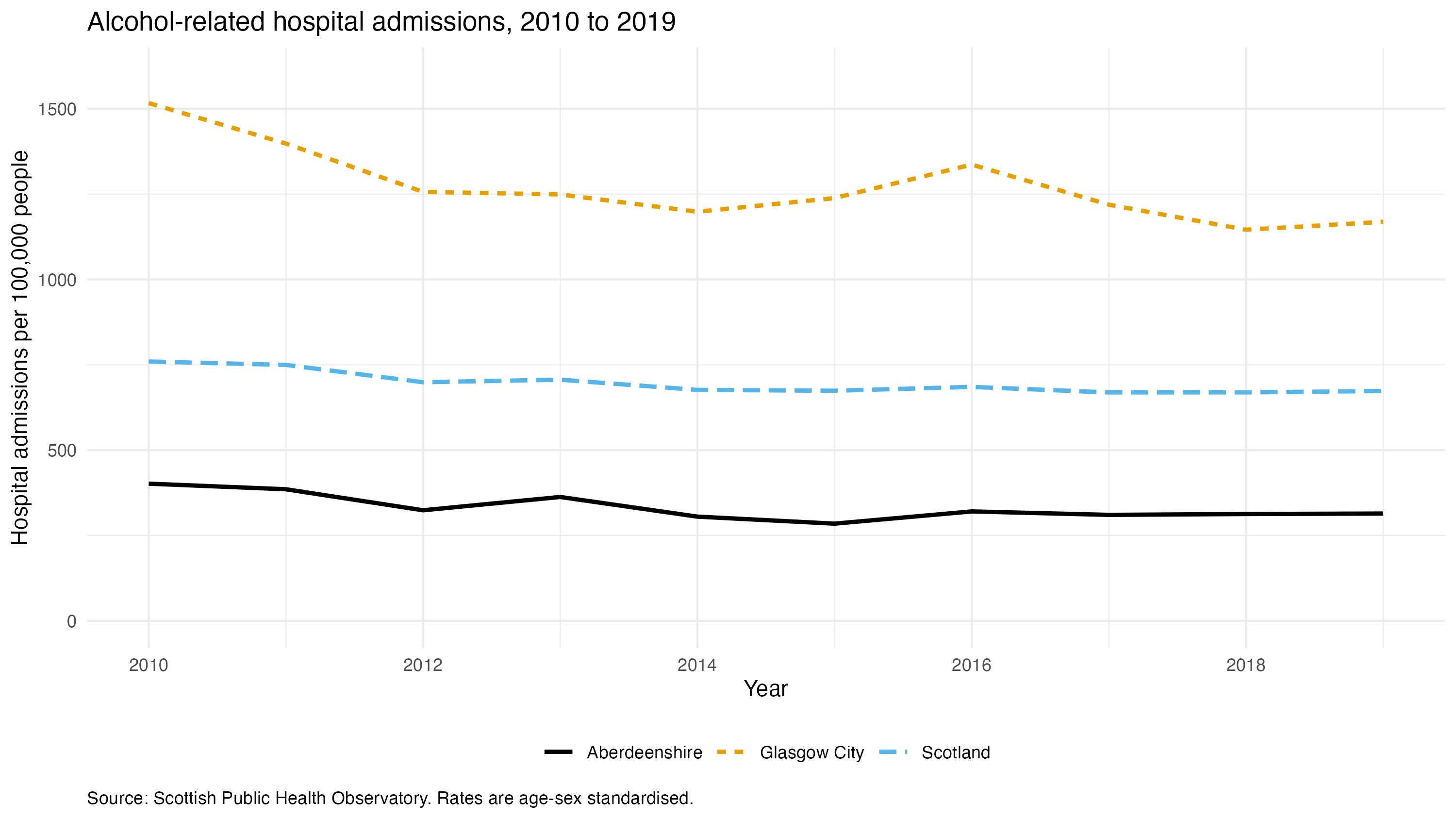
8.5.4 of the book again). Add the plot you exported in
Exercise 6, Q9, ex6_admissions.png, to
your report under a heading of its own. If you no longer have the file,
download it here and save it
into your output directory, the one you created in
Exercise 1, Q12.
There are two ways of doing this, so let’s try both.
- The quick way doesn’t need a code chunk at all, just a line typed in among your text. It looks like this, and you replace the two parts in capitals with your own:
An exclamation mark, then square brackets, then round brackets, with no spaces anywhere between them. Knit and check the figure appears.
- The other way puts the file into a code chunk instead, using the
include_graphics()function, which is another one from theknitrpackage you loaded in Q2. On its own that looks like more work for the same result, but it’s more flexible. Because the figure is now coming out of a chunk, all the chunk options are available to it, so you can caption it withfig.capexactly as you did in Q7 and set how much of the page width it takes up without.width. Again, replace the parts in capitals:
```{r YOUR-CHUNK-NAME, out.width = "50%", fig.cap = 'YOUR CAPTION'}
include_graphics("PATH/TO/YOUR/FILE.png")
```
Try it, and have a play with the out.width percentage
until the figure sits sensibly on the page.
- Now write two or three sentences underneath it. Say what the figure shows and what a reader should take away from it. A figure dropped into a report with nothing said about it leaves the reader to work out for themselves why it is there, which is your job rather than theirs.
One thing that catches everybody out. The path is relative to where
the .Rmd file is, not to your working directory. If the
image doesn’t appear, the path is almost always the reason.
Typed straight into your text:
And the same figure in a chunk, with a caption and set to the full width of the page:
```{r admissions-figure, out.width = "100%", fig.cap = 'Alcohol-related hospital admissions by council area.'}
include_graphics("output/ex6_admissions.png")
```
This one is a wide figure, so it’s worth giving it the whole width of the page. Something narrower, a portrait shaped figure especially, usually sits better at 60 or 70%.
With a few sentences to go under it:
Alcohol-related hospital admissions vary between council areas. Glasgow City
has consistently the highest rate in Scotland over this period and Aberdeenshire one of
the lowest, with the national average falling between the two.
12. Right, one more thing to go in the report. It records what you did to your data, but it doesn’t record what you did it with. R gets updated, packages get updated, and code that gives you one answer today can give you a slightly different one in a year or two.
The sessionInfo() function writes all of that down for
you. It prints your R version, your operating system, and every package
that was loaded when the document was knitted, along with its version
number. See Section
1.10 of the book for more explanation. Add a heading at the very end
of your report, ## Session information, and a code chunk
underneath it that calls sessionInfo().
Knit and have a look at what comes out. It isn’t pretty and nobody’s going to read it the way they read the rest of the report, but if you or somebody else ever reruns this and gets a different answer, that list is the first place to look. It costs you two lines and it’s what makes your report properly reproducible.
13. Optional. Last of all, if you have time, here’s one of the nicer things about R markdown. The same file will give you a completely different kind of document without you rewriting anything.
In your YAML header, change pdf_document to
html_document and knit. You’ll get a html file instead
which you can open in your browser. This has been built from exactly the
same text, code and figures. Change the header back to
pdf_document before you finish.
You don’t have to edit the YAML to do this. Click the small black triangle next to the Knit button and you can pick a format straight from the menu, the one in the picture back in Q1, which overrides whatever your YAML header says for that one knit. It’s quicker for a look, but the YAML is where you set what your document actually is.
The finished report
Here’s the whole thing in one piece. cardiac_report.Rmd is the document this exercise builds, with every question’s answer already in it. Right click and choose ‘save link as’ if it opens in your browser rather than downloading.
It needs data/cardiacdata.txt and
output/ex6_admissions.png alongside it in a Project,
exactly as the exercise describes, and then it will knit to PDF as it
stands. Use it to check your own against, or keep it as a template to
start your next report from.
Two things we haven’t covered
The visual editor. RStudio can show an R markdown document formatted as you type, more like a word processor, hiding the markdown syntax. Look for the pair of buttons marked Source and Visual at the top left of the editor toolbar, just above your document, and click Visual. The keyboard shortcut is Ctrl+Shift+F4, or Cmd+Shift+F4 on a Mac. It’s genuinely useful, especially for tables and links. We’ve left it until now on purpose, so that you learn what the markdown underneath actually looks like first, because when something goes wrong it’s the markdown you have to fix.
Quarto. Quarto is the successor to R markdown. It does the same job, works with languages other than R, and its syntax is so close that nearly everything in this exercise transfers unchanged. If you carry on using R after this course you’ll meet it. Start at quarto.org.
End of Exercise 7