Exercise Solutions
Poisson GLM - predicting species richness
The data for this exercise were collected during an experiment which
investigated the relationship between the number of plant species and
plant biomass grown in plots with 3 controlled pH treatments: low,
medium and high pH. The research seeks to find out if increasing biomass
has an effect on species richness, and if this effect could be modulated
by pH. Therefore, Species is the response variable and
pH and Biomass are explanatory variables.
Because the number of species is a count (positive and integer), we will
attempt to fit a Poisson distribution to these data.
1. As in previous exercises, either create a new R script (perhaps
call it GLM_Poisson) or continue with your previous R script in your
RStudio Project. Again, make sure you include any metadata you feel is
appropriate (title, description of task, date of creation etc) and don’t
forget to comment out your metadata with a # at the
beginning of the line.
2. Import the data file ‘species.txt’ into R and take a look at the
structure of this dataframe. Start with an initial data exploration
(using pairs() and coplot()?). Do you see any
imbalance of concern between the predictors? Do you foresee any problem
for the model to answer the initial question?
- Hints:
- the Poisson model uses a log-link, therefore the equation of the model (the linear predictor) will predict the expected number of plant species on the log scale.
- for a corresponding data exploration it would make sense to use the log of the response.
- check that the format of pH is appropriate and that the reference level is what you want.
- restrict the plot to the variables you actually need
- an effective way of doing this is to store the names of the
variables of interest in a vector
VOI<- c("Var1", "Var2", ...) - and then use the naming method for subsetting the data set
Mydata[, VOI]
sp<- read.table(file= "./data/species.txt", header= TRUE)
str(sp)
## 'data.frame':    90 obs. of  3 variables:
##  $ pH     : chr  "high" "high" "high" "high" ...
##  $ Biomass: num  0.469 1.731 2.09 3.926 4.367 ...
##  $ Species: int  30 39 44 35 25 29 23 18 19 12 ...

sp$logSp<- log(sp$Species)
sp$pH<- factor(sp$pH, levels= c("low", "mid", "high"))

# make a list of the variables of interest, for convenience:
VOI<- c("logSp", "Biomass", "pH")
pairs(sp[, VOI])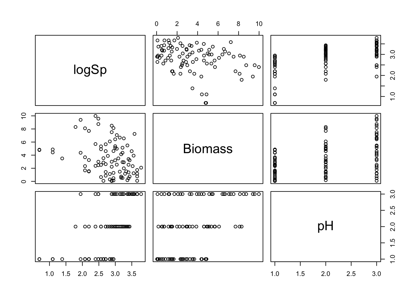
# Biomass tends to increase with pH, which could generate
# some collinearity between these explanatory variables in a model.
# but still plenty of variation in Biomass within each pH,
# so hopefully this won't be an issue.

coplot(logSp ~ Biomass | pH, data= sp)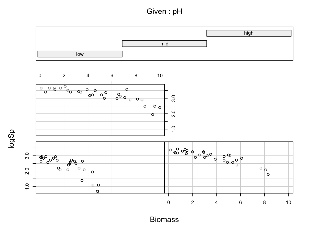
# the relationships look clean and well distinct between treatments,
# supporting the idea of an interaction.
3. To warm up, let’s start with a simple Poisson GLM (using
glm) including only Biomass as a predictor.
Hints: + take some time to think what the appropriate response variable
is! + if in doubt, make sure to ask someone to help clear this with you.
+ remember to specify the assumed distribution of the data in
glm()
4. Obtain summaries of the model output using the
summary() function. Make sure you understand the
mathematical and biological interpretation of the model, by writing down
the complete model on paper.
summary(sp.glm1)
##
## Call:
## glm(formula = Species ~ Biomass, family = poisson, data = sp)
##
## Coefficients:
##              Estimate Std. Error z value Pr(>|z|)
## (Intercept)  3.184094   0.039159   81.31  < 2e-16 ***
## Biomass     -0.064441   0.009838   -6.55 5.74e-11 ***
## ---
## Signif. codes:  0 '***' 0.001 '**' 0.01 '*' 0.05 '.' 0.1 ' ' 1
##
## (Dispersion parameter for poisson family taken to be 1)
##
##     Null deviance: 452.35  on 89  degrees of freedom
## Residual deviance: 407.67  on 88  degrees of freedom
## AIC: 830.86
##
## Number of Fisher Scoring iterations: 4

# Model description:
# Species_i ~ Poisson(mu_i)
# log(mu_i) = 3.18 - 0.064*Biomass_i
5. According to this model, what would be the predicted value (by hand) on the link scale log(mu) when Biomass= 5? What would this become on the response scale, i.e. the number of species?
# On the link scale:
3.18 - 0.064*5 # 2.86
## [1] 2.86
# On the response scale (species count):
exp(3.18 - 0.064*5) # 17.46
## [1] 17.46153
6. Now, specify a more useful Poisson GLM (using glm) to
match the stated research questions.
7. Obtain summaries of the model output using the
summary() and the ANOVA of the model. Which of the
drop1() or anova() functions would you choose
to use if you wanted (A) to look at deviance components or (B) to do
model simplification? Is the effect of the interaction significant?
summary(sp.glm2)
##
## Call:
## glm(formula = Species ~ Biomass * pH, family = poisson, data = sp)
##
## Coefficients:
##                Estimate Std. Error z value Pr(>|z|)
## (Intercept)     2.95255    0.08240  35.833  < 2e-16 ***
## Biomass        -0.26216    0.03803  -6.893 5.47e-12 ***
## pHmid           0.48411    0.10723   4.515 6.34e-06 ***
## pHhigh          0.81557    0.10284   7.931 2.18e-15 ***
## Biomass:pHmid   0.12314    0.04270   2.884 0.003927 **
## Biomass:pHhigh  0.15503    0.04003   3.873 0.000108 ***
## ---
## Signif. codes:  0 '***' 0.001 '**' 0.01 '*' 0.05 '.' 0.1 ' ' 1
##
## (Dispersion parameter for poisson family taken to be 1)
##
##     Null deviance: 452.346  on 89  degrees of freedom
## Residual deviance:  83.201  on 84  degrees of freedom
## AIC: 514.39
##
## Number of Fisher Scoring iterations: 4
anova(sp.glm2, test= "Chisq")
## Analysis of Deviance Table
##
## Model: poisson, link: log
##
## Response: Species
##
## Terms added sequentially (first to last)
##
##
##            Df Deviance Resid. Df Resid. Dev  Pr(>Chi)
## NULL                          89     452.35
## Biomass     1   44.673        88     407.67 2.328e-11 ***
## pH          2  308.431        86      99.24 < 2.2e-16 ***
## Biomass:pH  2   16.040        84      83.20 0.0003288 ***
## ---
## Signif. codes:  0 '***' 0.001 '**' 0.01 '*' 0.05 '.' 0.1 ' ' 1

# anova is useful for getting an idea of the relative contributions
# of each term, but beware that order does matter for all but the last term!

# drop1 would provide the same answer in this case, since there are
# no other interactions involved (and interactions are always last).
# In general this would be the method of choice if our purpose is
# to perform model simplification.

drop1(sp.glm2, test= "Chisq")
## Single term deletions
##
## Model:
## Species ~ Biomass * pH
##            Df Deviance    AIC   LRT  Pr(>Chi)
## <none>          83.201 514.39
## Biomass:pH  2   99.242 526.43 16.04 0.0003288 ***
## ---
## Signif. codes:  0 '***' 0.001 '**' 0.01 '*' 0.05 '.' 0.1 ' ' 1

# the ANOVA table provides a global test across pH levels.
# However the significance of the interactions is also unambiguous
# from the summary table, in this case, although the null hypothesis
# is different (coefficient different from zero in the latter
# vs. significant proportion of variation explained in the former).
8. Make sure you understand the individual components of the two types of summaries, null hypotheses, and the mathematical and biological interpretation of the different coefficients (i.e. would you be able to reconstruct and to use the model formula to make predictions? In doubt, try it and seek assistance!). Any indication of overdispersion? (Hint: check residual deviance and degrees of freedom)
9. Is everything significant? Which of the summaries above do you prefer to use, if you would like to explain the predictions, or test hypotheses, or perform model selection?
10. Obtain summaries of the model output using the
summary() function.
- How do you interpret the model terms?
- what does the
Interceptrepresent, and which categories does it apply to? - what does the
Biomasseffect represent, and which category does it apply to? - what does the
pHmideffect represent? - what does the
Biomass:pHmideffect represent?
- what does the
# "(Intercept)" is the predicted value on the link (log) scale for
# Biomass = 0, and pH= "low"

# "Biomass" is the slope of Biomass for the low pH category.
# It is negative, so assumes a linear decrease (on the log scale)

# "pHmid" is the estimated difference (on the log scale) between
# the "pHmid" and the reference level, "pHlow".
# Positive means higher on average than pHlow.

# "Biomass:pHmid" is the difference between the slope of Biomass for pHmid
# compared to the slope of Biomass for the reference level, "pHlow".
# Positive means that the decrease is slower in "pHmid" (although this is
# for the linear relationships on the log scale, but it may not look
# the same on the response scale - see the graphical interpretation below)

# A mathematical description of the model
# (more or less how I would present it in the methods section of a paper):
# Species ~ Poisson(mu)
# log(mu) = 2.95 - 0.26 * Biomass
#    + 0.48 * pHmid
#    + 0.82 * pHhigh
#    + 0.12 * Biomass * pHmid
#    + 0.16 * Biomass * pHhigh

# The coefficients are on the log scale,
# so cannot be interpreted directly as counts.
# They are interpreted as changes in log-counts:

# For a biomass of zero, the log of the number of species at medium pH
# is increased by 0.48 compared to the low pH.
# This is equivalent to saying that the counts increase by exp(0.48),
# hence that they are multiplied by 1.62.
11. Validate the model using the standard residuals diagnostic plots

# nothing particularly bad...
# the variance of the standardized residuals ("Pearson") tends to decrease
# slightly, when it should be constant (underdispersion).
# a few observations poorly predicted (18, 20) and slight
# overestimation of the smaller values (left end of top-left graph),
# just to be picky.
# There is no expectation that the residuals should be normally distributed
# (thus QQplot not particularly useful)

# we can produce more residual plots if desired:
# extract various residuals and plot
res.p<- resid(sp.glm2, type= "pearson")
res.d<- resid(sp.glm2, type= "deviance")

fit<- fitted(sp.glm2) # on the response scale

plot(res.p, res.d); abline(0,1) # deviance against Std Pearson residuals
# quite similar in this model (no overdispersion, moderate underdispersion)
plot(fit, res.d, ylab= "Deviance residuals", xlab= "Fitted values (response scale)")
abline(h= 0, col= 2, lty= 2)

# residuals against the predictors:
plot(sp$pH, res.p, ylab= "Std Pearson residuals", xlab= "pH")
abline(h= 0, col= 2, lty= 2)
# low pH plots are more variable

plot(sp$Biomass, res.p, ylab= "Std Pearson residuals", xlab= "Biomass")
abline(h= 0, col= 2, lty= 2)
# Species richness over-predicted for highest and lowest Biomass plots
# Few cases: could be by chance?
12. Use predict() with the argument
type= "response" to obtain the fitted values on the
original (response) scale. Plot a fitted line for the relationship
between number of species and biomass for each level of pH. Why are the
lines not straight?
par(mfrow= c(1, 1))
# create a sequence of increasing Biomass
Biomass.seq<- seq(from= min(sp$Biomass), to= max(sp$Biomass), l= 25)
# predict for a range of biomass values and a low pH
MyData1<- data.frame(Biomass= Biomass.seq, pH= "low")
# predict for a range of biomass values and a mid pH
MyData2<- data.frame(Biomass= Biomass.seq, pH= "mid")
# predict for a range of biomass values and a high pH
MyData3<- data.frame(Biomass= Biomass.seq, pH= "high")

P.low<- predict(sp.glm2, newdata= MyData1, type= "response")
P.mid<- predict(sp.glm2, newdata= MyData2, type= "response")
P.high<- predict(sp.glm2, newdata= MyData3, type= "response")

plot(sp$Biomass, sp$Species, col= sp$pH, xlab= "Biomass", ylab= "N species")
# when pH is converted to numeric,
# you get 1 for "low", 2 for "med" and 3 for "high"
# color 1 means black in R
# color 2 means red in R
# color 3 means green in R

lines(MyData1$Biomass, P.low, lty= 1, col= 1)
lines(MyData2$Biomass, P.mid, lty= 1, col= 2)
lines(MyData3$Biomass, P.high, lty= 1, col= 3)

legend("topright",
 legend= c("high", "mid", "low"),
 col= c(3:1),
 lty= c(1, 1, 1),
 lwd= c(1, 1, 1))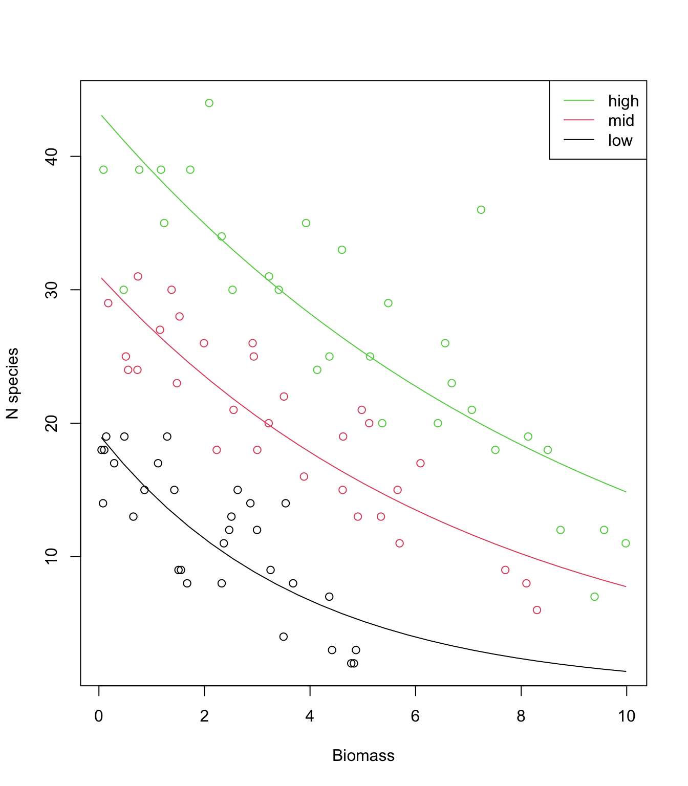
13. (Optional) Use predict again, but this time obtain
the fitted values on the scale of the linear predictor
type= "link". Plot again and compare with the previous
graph: what is happening? How would you back-transform these values
predicted on the link scale to plot them on the response scale
again?
P.low<- predict(sp.glm2, newdata= MyData1, type= "link")
P.mid<- predict(sp.glm2, newdata= MyData2, type= "link")
P.high<- predict(sp.glm2, newdata= MyData3, type= "link")

plot(sp$Biomass, sp$Species, col= sp$pH, xlab= "Biomass", ylab= "Number of species")

lines(MyData1$Biomass, P.low, lty= 1, col= 1)
lines(MyData2$Biomass, P.mid, lty= 1, col= 2)
lines(MyData3$Biomass, P.high, lty= 1, col= 3)
# lines are straight and appear in the wrong place!
# Because they are on the link scale (observations are on the response scale)

# back-transform the predictions to make them on the response scale
# (note the 'exp')
lines(MyData1$Biomass, exp(P.low ), lty= 1, col= 1)
lines(MyData2$Biomass, exp(P.mid ), lty= 1, col= 2)
lines(MyData3$Biomass, exp(P.high), lty= 1, col= 3)
# Better?

legend("topright",
 legend= c("high", "mid", "low"),
 col= c(3:1),
 lty= c(1, 1, 1),
 lwd= c(1, 1, 1))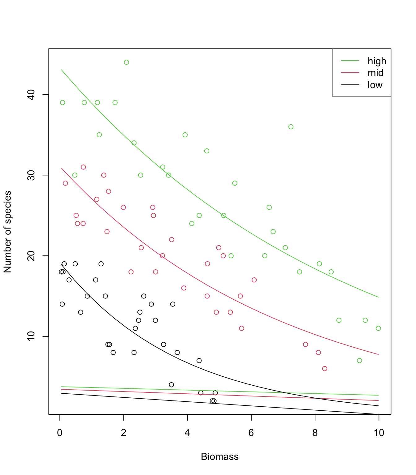
14. (Optional but recommended) Use predict again, but
this time obtain the fitted values and their standard errors on the
scale of the linear predictor. From these, calculate confidence
intervals for the fitted values, and plot them together with the data,
after back-transforming the fitted values and intervals on the response
scale.
- Suggested approach:
- plot the raw data (one colour per pH)
- create a
data.framecalledXcontaining the data to predict for: as sequence of increasing Biomass and the pH of your choice - use
predict()with the appropriate optionstype= "link", se.fit= TRUEto obtain the fitted values on the link scale and for being able to calculate the confidence intervals later. Store in objectZ. - plot fitted values, extracted using
Z$fit, against the Biomass sequence. Do not forget to back-transform on the response scale. - plot the upper bound of the 95% CI (fitted values + 1.96*se),
extracted using
Z$fitandZ$se.fit, against the Biomass sequence. Do not forget to back-transform on the response scale. - plot the lower bound of the 95% CI (fitted values - 1.96*se),
extracted using
Z$fitandZ$se.fit, against the Biomass sequence. Do not forget to back-transform on the response scale. - repeat for other pH values.
P.low<- predict(sp.glm2, newdata= MyData1, type= "link", se.fit= T)
P.mid<- predict(sp.glm2, newdata= MyData2, type= "link", se.fit= T)
P.high<- predict(sp.glm2, newdata= MyData3, type= "link", se.fit= T)

plot(sp$Biomass, sp$Species, col= sp$pH, xlab= "Biomass", ylab= "Number of species")

# back-transform the predictions to make them on the response scale
# (note the 'exp')
lines(MyData1$Biomass, exp(P.low$fit ), lty= 1, col= 1)
lines(MyData2$Biomass, exp(P.mid$fit ), lty= 1, col= 2)
lines(MyData3$Biomass, exp(P.high$fit), lty= 1, col= 3)

# same for the lower bound of the 95% CI
lines(MyData1$Biomass, exp(P.low$fit  - 1.96*P.low$se.fit ), lty= 3, col= 1)
lines(MyData2$Biomass, exp(P.mid$fit  - 1.96*P.mid$se.fit ), lty= 3, col= 2)
lines(MyData3$Biomass, exp(P.high$fit - 1.96*P.high$se.fit), lty= 3, col= 3)

# now the upper bound of the 95% CI
lines(MyData1$Biomass, exp(P.low$fit  + 1.96*P.low$se.fit ), lty= 3, col= 1)
lines(MyData2$Biomass, exp(P.mid$fit  + 1.96*P.mid$se.fit ), lty= 3, col= 2)
lines(MyData3$Biomass, exp(P.high$fit + 1.96*P.high$se.fit), lty= 3, col= 3)

legend("topright",
 legend= c("high", "mid", "low"),
 col= c(3:1),
 lty= c(1, 1, 1),
 lwd= c(1, 1, 1))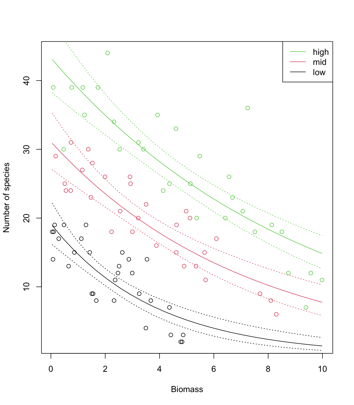
15. Looking at the data and model fits, any idea why expected species richness for the largest values of biomass tends to be biased high? How satisfied are you with the model? Have we learned anything from it, about species diversity in relation to pH and biomass?
# The data show a very steep decline in species richness towards zero,
# as biomass increases.

# The log-link allows to transform the straight lines (on the link scale)
# into curves (on the response scale), while ensuring that predictions
# are always positive. But the log link doesn't allow enough flexibility
# for the decline to happen as fast as it does in the data
# while remaining positive for any value of biomass.

# The model (a straight line for each pH) is too simple to capture this
# level of detail in the data, and hence is biased.

# However it does a pretty good job overall, and can be trusted to
# make robust inference about the general trends.

# Note that the interaction is not obvious on the response scale,
# as the curves look quite "parallel". It is indeed one of the
# peculiarities of transformations (like the log), that parallel lines
# on one scale will not be so on the other scale.
# Caution is therefore required in interpreting effects from the
# summary of the model directly, and plotting on the response scale
# is critical before drawing any conclusion!
End of the Poisson GLM exercise